Thanks for trying the Luminate theme! If you don’t find you question answered here, try our general documentation page or contact support.
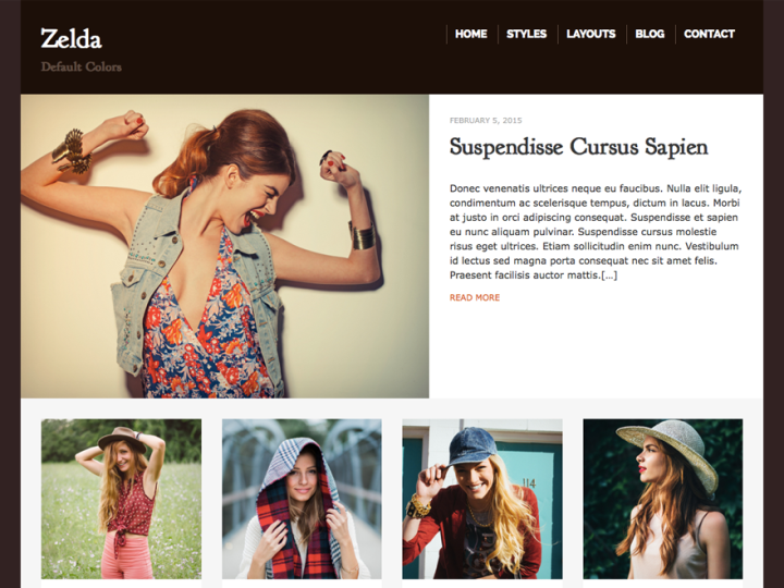
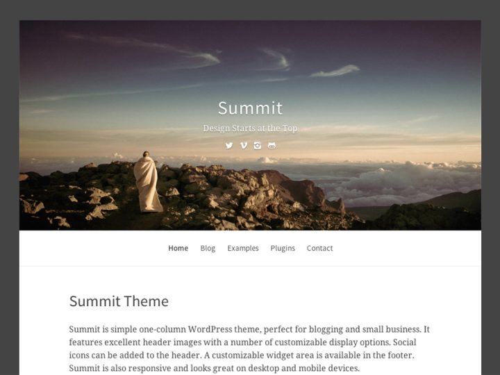
Page Showcase
To set up the page showcase layout as shown in the demo, please follow the steps below:
- Create a new page or edit an existing page that will be used as the Showcase. Then select the “Page Showcase Template” (found in the right column in your editor window).
- You’ll can also choose a layout for this template. There’s four options: Single Column, Single Column Narrow, Sidebar Right, or Sidebar Left. If you want to use a specific layout, go ahead and select this (also in the right column of the editor window). Then click save.
- If you want the Showcase to appear on your home page, go to your Dashboard and under Settings > Reading, set the page from step 1 as your “Front Page”. If you’re using the Page Showcase on the home page and would still would like to have a blog displayed separately, create a blank page called “Blog” or something similar and select that as “Posts Page” under Front Page.
- To select which pages show on the showcase page, go to your Dashboard and under Appearance > Customize look for the “Page Showcase” options. You can set up to 5 pages.
- If you are using on the of the single column layouts, select 4 pages to display. If you’re displaying a sidebar, you can choose 3 or 5.
Menus
There are three available menus areas. The primary menu displays to the right of your site title or logo. The top menu displays are the in the bar above your logo. The footer menu displays in the footer. Each menu is optional.
To set up new menus, go to Appearance > Menus in your Dashboard.
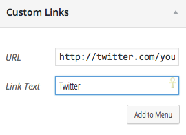
To activate the social media icons feature, simply create a custom link with a link to the account/profile page as shown below:
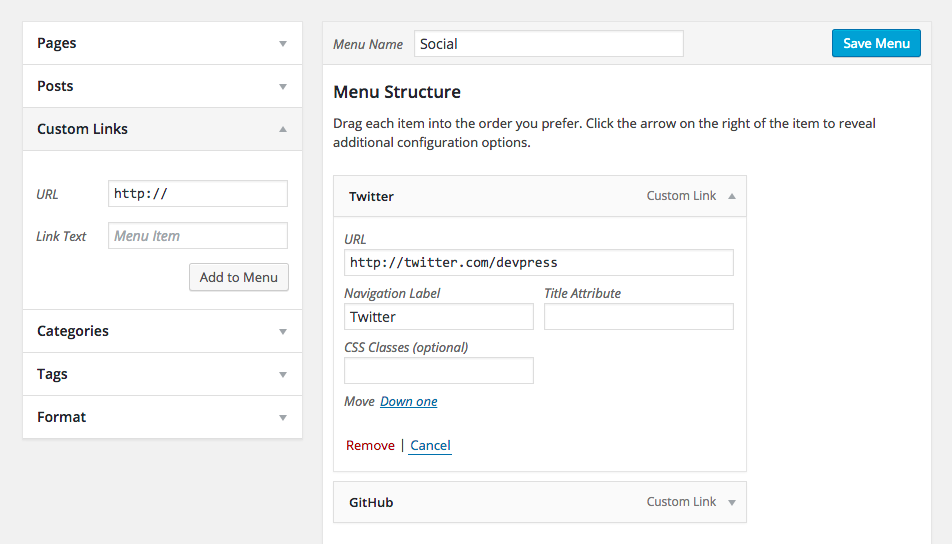
You can add these links to your header or footer menu.
The following social networks have custom icons available:
- behance.com
- dribbble.com
- facebook.com
- flickr.com
- github.com
- linkedin.com
- pinterest.com
- plus.google.com
- instagr.am
- instagram.com
- skype.com
- spotify.com
- tumblr.com
- twitter.com
- vimeo.com
If you need another service added, please open a support request.
Customization Options
With the Luminate theme, you have a number of different customization options for your site.
Styling and general options are available under Appearance > Customize.
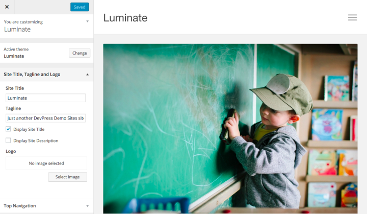
Site Title, Tagline and Logo
- Here you can upload your own logo, if desired. You can also choose to display a site tagline or title.
Top Navigation
- If you have a “Top Menu” set, it will display in the bar above the header. You can also set text to display here, like a phone number or office hours.
Layout
This theme has four layout options in addition to the Showcase Template:
- Single Column
- Narrow Column
- 2 Columns: Content / Sidebar
- 2 Columns: Sidebar / Content
Colors
- Background Color sets the overall website background color.
- Highlight Color changes link color in the content section and button backgrounds.
- Highlight Hover changes the hover link color in the content section.
Widget Areas
Luminate has two widget areas, one for the sidebar and one for the footer.
For the sidebar, it will display on all posts, if a sidebar layout is selected under Layout in the Customize area. A sidebar will display on individual pages if the sidebar display option is selected in the Page Editor.
For the footer, the display of widgets will depend on how many are selected. One or two widgets will expand to fill the entire footer area. Three or more widgets will cause the footer to display in three columns.